Overview

Bullish is a cryptocurrency exchange platform offering new automated market making, lending, and portfolio management tools to its users globally. Launched in 2021, the growing team spans across Hong Kong, Washington, D.C., Singapore, Gibraltar, and Cayman Islands.
Duration

1.5 months

Role & Responsibilities

A team made up of 2 primary UI designers with myself included, we were teamed up with a UX designer to redesign the Careers page. I was tasked with the UI designs as well as working with the team to prepare pixel perfect designs, handoff to development, and then later QA designs.

Following the launch of the new Career page, I worked with the UX designer to track and report the data results.

Problem

Bullish Global was looking to have a more robust career page that better represented the overall culture and a way to showcase the company brand. The old Careers page was missing the human aspect and did not drive enough users to the job listings. A redesign of the homepage also prompted the need to update careers to match the new brand.

Bullish hoped to bring in more interest from people with a diverse background by emphasizing on the people, flexible working environment, and volunteer opportunities.

Research

Target audience: job seekers

As there was an existing page, we started by identifying the key problems of the page and a UX/UI audit to understand areas of improvement.

Areas to improve
  • Call to action to the job listings – location and visual
  • Lack of the human aspects and relatable feel
  • Legacy look and feel which did not match the redesigned homepage

Process

popup image
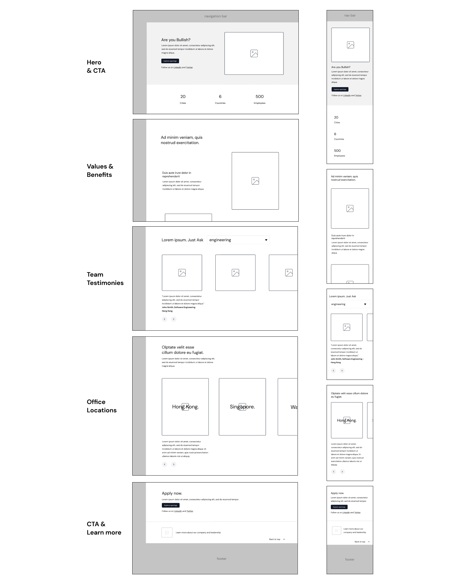
Wireframes

During the wireframing process, layout, hierarchy, and possible design alternatives were explored. Since it was decided that the page would incorporate more photos of real employees in the office, interacting and working with one another, it was essential to make sure the layout balanced well with content.

UI Design & Visuals

After a few rounds of feedback from stakeholders, I worked on translating the wireframes into several iterations of low fidelity designs. This included explorations of photo placement, proposal of new components where needed while leaning on as many existing components as possible. Explorations of the rebrand to match the homepage were made during this phase as well.

Final Designs

Once we landed on a direction, we began high fidelity designs and prototypes. We worked with the development team to understand feasibility of some of the new components by sharing high-fidelity Figma prototypes.

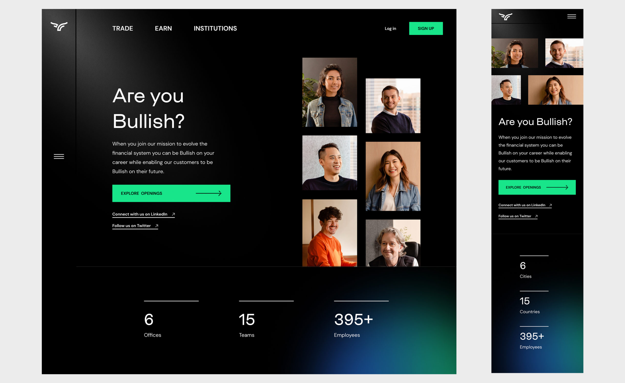
Hero + CTA

The placement of the CTA for job openings was brought into the hero to emphasize the main action to drive users to click.

Hero + CTA

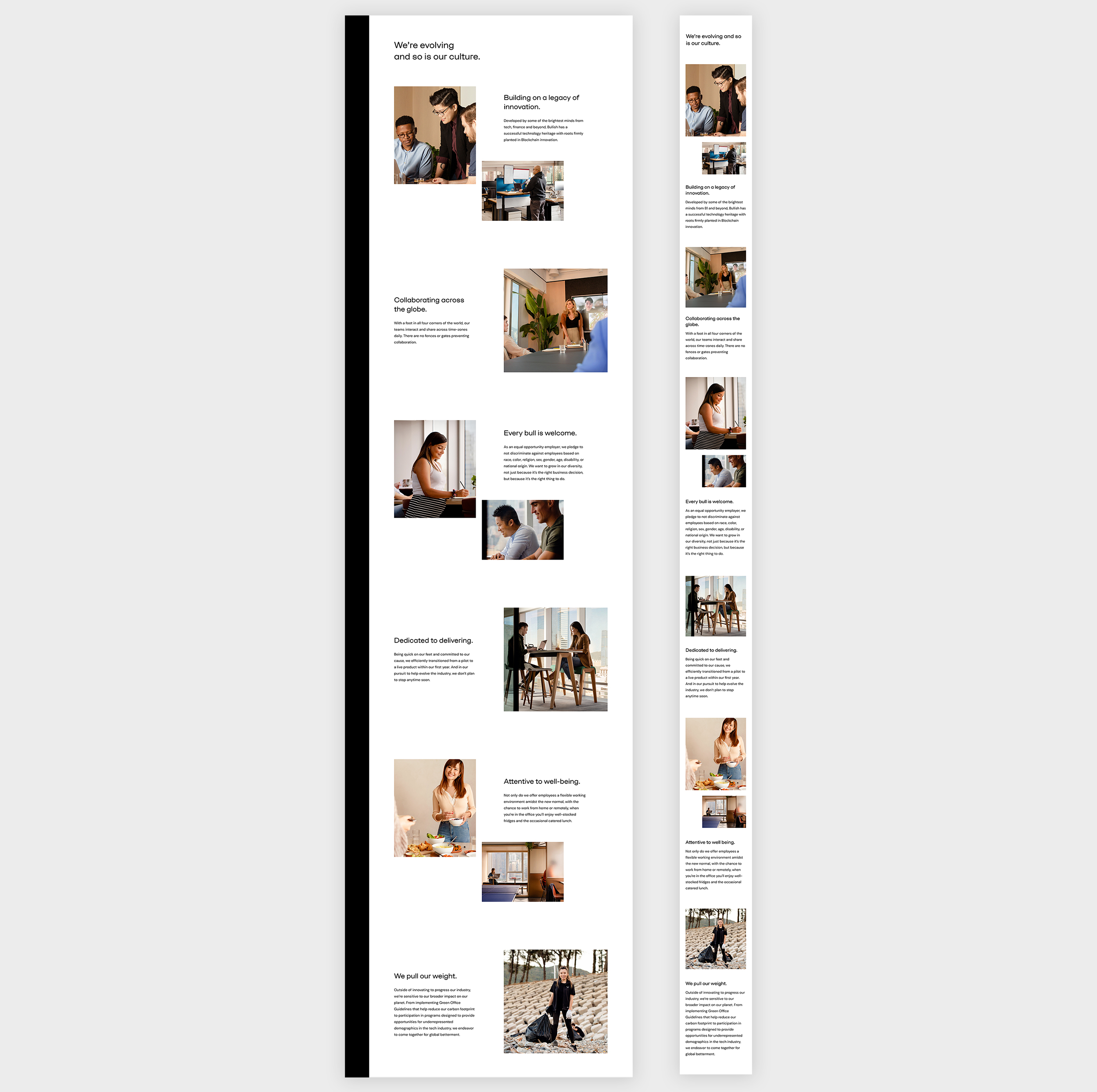
Benefits + Values

To give an authentic look into the company culture, the brand team worked to photograph employees working and interacting in the office. Based on the wireframes, myself and another designer came to a collaged look and feel to capture different perspectives of each benefit or value point.

Benefits + values

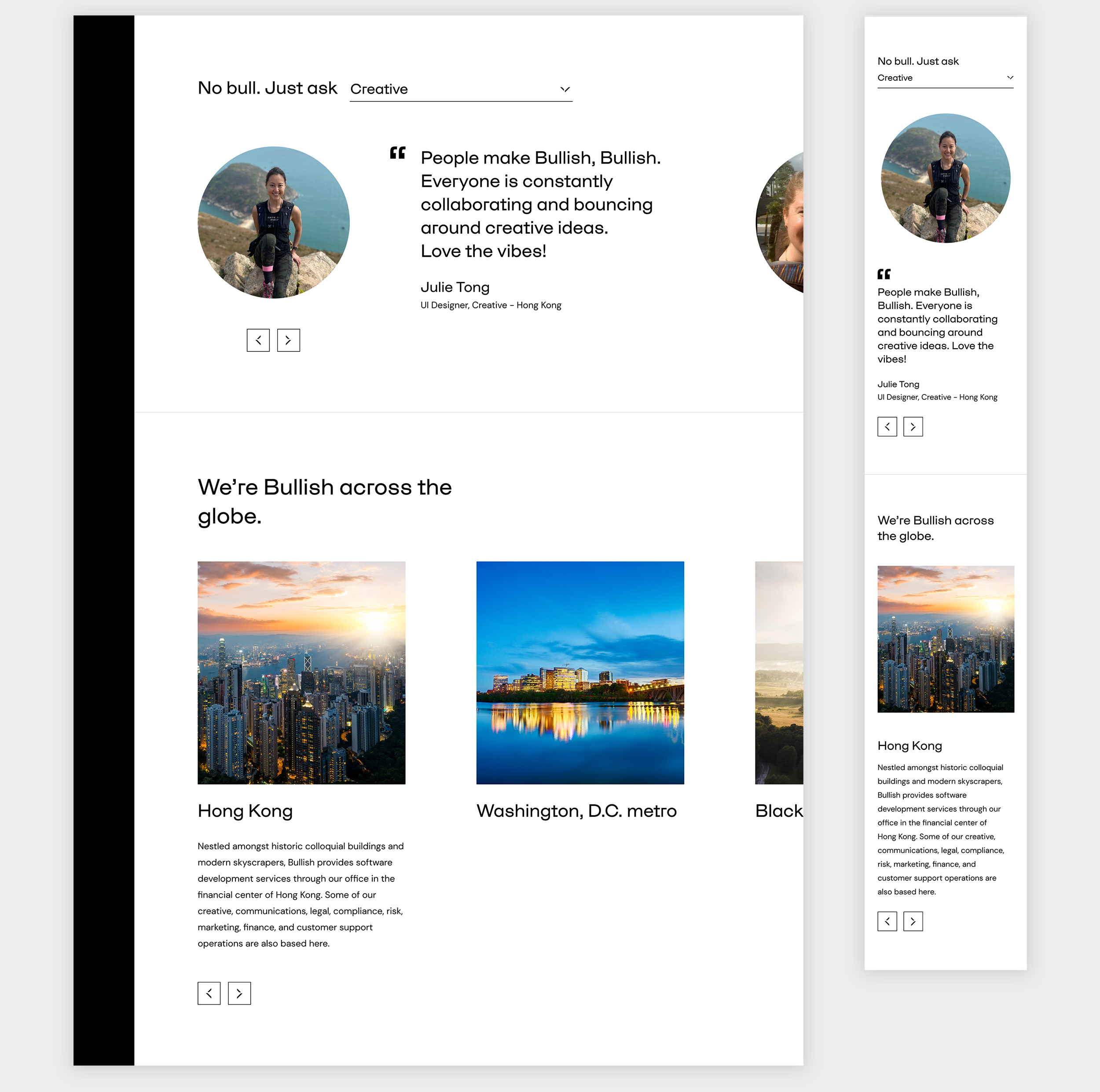
Testimonials + Office locations

Testimonials and office locations are both utilizing the carousel component. Each has a different interaction in mind to best fit how users would navigate.

The testimonial carousel allows users a way to look into different departments or skip to a particular one via the dropdown. Continuous clicking of the arrows will automatically lead users into each department as well.

The location carousel stays consistent in a similar way but is less complex. To reduce information overload, the description for each location only shows when in focus.

Testimonials + office locations

CTA + Learn More

To catch users who have scrolled and read through the entirety of the page, a version of the CTA was also added to the bottom.

CTA + Learn more

Outcome

After the launch of the new Careers page, data showed that more users were selecting the ‘Explore job openings’ in the hero. We also saw an increase in engagement for the page, resulting in more interest in the open positions.

Overall, this project was very exciting for me as I was able to see the positive results in numbers and feedback from stakeholders. I felt that the goals of this project were met by increasing engagement, clicks but also showcases the company brand in an authentic way.