Overview
Following a name change from Canvas to GoCanvas, the growing company needed an update to their logo mark and visual identity.
Following a name change from Canvas to GoCanvas, the growing company needed an update to their logo mark and visual identity.
Logo and Brand Identity Designer
Over the course of a month, several designers were involved in ideation and the design of a new logo. I began with sketching variations and ideas of the logo based off how different people described the company in a few words.
“Infinite possibilities” was a concept that resonated most. The variation with the symbol combined ‘go’ was chosen as the final logo design.
The next step was developing the colors, visual system, and typeface for the brand. As the lead, I worked with the team to research and combine all findings to one mood board. Different variations of color, icons, and typefaces were presented to stakeholders and was narrowed down to the best solution. The end result was a cleaner and friendlier identity system that better aligned with GoCanvas’ purpose, vision and product.
Find it here→
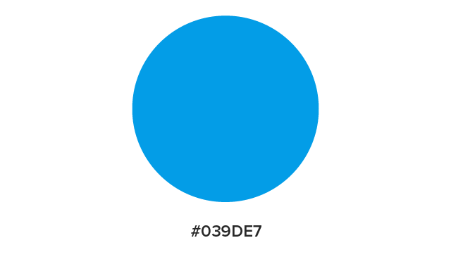
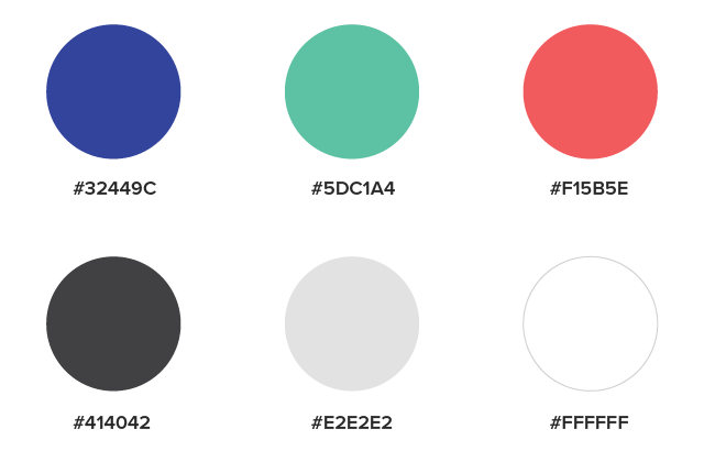
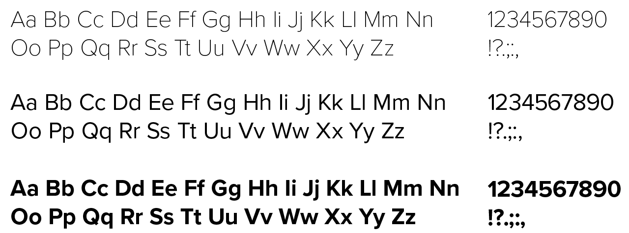
The type selection and color scheme were chosen to be readable and friendly across all resolutions and point sizes.


Proxima Nova was chosen based on the more geometric appearance to tie it into the illustrations, icons, and overall brand.

Every icon was carefully made with the basic rules of geometry for consistency. The pause in the outline mimics the new logo design to tie those together.
![]()
Additionally, each icon was hallway tested to make sure they were well understood with little context and was legible at all sizes.
Find it here→
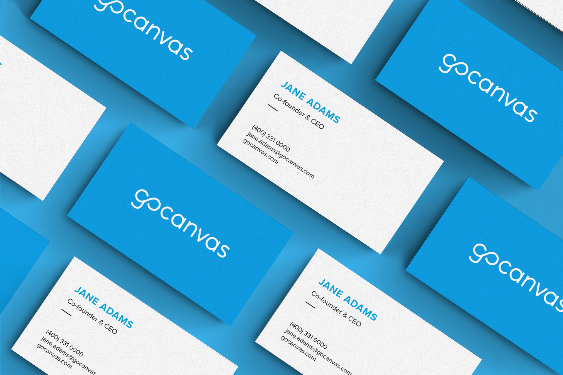
While GoCanvas prided itself on being a paperless company, there was still a need for updated business cards in order to tie in the new branding.
The biggest complaint among employees who attended trade shows and client meetings – they could not write on it. The old card design was a black on both sides and was difficult to write on a normal pen.

The process of rebranding an existing, outdated brand was tedious but was very rewarding in the end. It was amazing to see the designs bring together employees behind a brand they felt they could proudly take with them, wear, and represent.